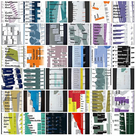
Whilst browsing the MOMA recent acquisitions site, as you do, I noticed that 39 Posters by Willi Kunz,, created for Columbia University Graduate School of Architecture Planning and Preservation lecture series, have been added to the MOMA collection.
These brought back some powerful memories. I saw them pinned up at college by a tutor who must have been on Columbia's mailing list - I knew I should have pinched them off the wall. And I was in New York in 1990 and went to the Jean Baudrillard lecture shown here.
I've created a Flickr set of 36 of them. Taken as a whole they are quite overwhelming, too much to take in - I find myself sucking for air. Poring over them individually, you can see a master at work, a perfect blending of typographic control and expressive composition.

Willi Kunz. (American, born 1943). Columbia University, Graduate School of Architecture, Planning and Preservation Lecture Series Fall 1984. 1984. Lithograph, 24 x 12" (61 x 30.5 cm). Gift of the designer
As Ellen Lupton wrote in an essay originally intended for Kunz' book Micro + Macroaesthetics:
"Kunz explained in Octavo, “Through the translation of architectural elements into typography, the posters present a visual summary of the quality and spirit of the events they announce.” In a series of posters for architectural lectures and exhibitions at the GSAPP, this act of “translation” takes form through grid-like geometric frameworks, partially filled in with color or expressed with rules, which serve both to create abstract compositions and to organize information. Kunz uses typographic bars and the play of positive and negative space to suggest metaphoric “floors” and “foundations,“openings in a wall surface, and symbolic staircases.
Kunz began designing this series of bi-annual posters in 1984. The series, which Kunz continues to produce today, is a remarkable document of one designer’s work for a single client over more than a decade. The posters’ consistent format and precise focus link them into a coherent sequence, while allowing Kunz remarkable room for variation. It is fascinating to watch his use of color, form, and typography shift to reflect changing ideas in the architectural world."
