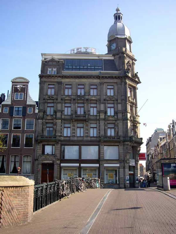
In 1933 Dutch architect Gerrit Rietveld designed a circular steel and glass pavilion to be mounted on the roof of the luxury department store Metz & Co. in Amsterdam. Its still there today, now used as a cafe, a little modernist jewel atop the traditional Dutch building. With it, Rietveld perhaps created the first Modernist example of parasitic architecture.
In choosing to build their World Cup studio on the roof of a building in Cape Town, the BBC so nearly got it right, but in the end, like a Lee Dixon backpass, it went wildly astray.
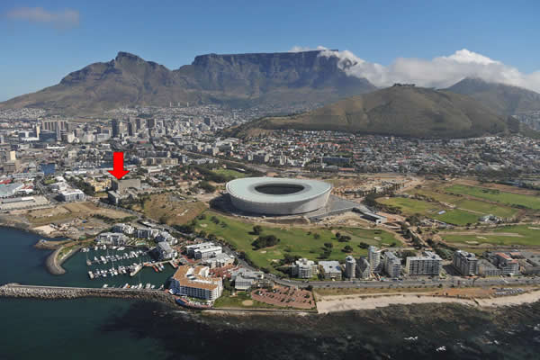
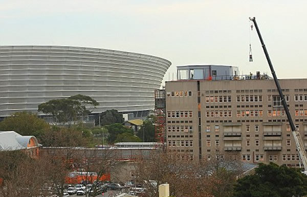
The Beeb decided to forego basing their TV studio for the 2010 World Cup in Johannesburg (where the official media facilities were based), and instead chose to spend £1m building a pentagonal shaped, rooftop glass box on the roof of the Somerset Hospital in Cape Town, providing a panoramic view over the city including Table Mountain in the distance.
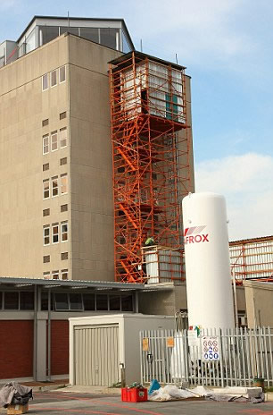
Spending a million quid of licence-payers money on a TV studio is the sort of thing that presses all of the buttons at the Daily Mail, (and also any excuse to bash the BBC, at the Murdoch owned News of the World), both of which have expressed various levels of outrage, and schadenfreude when fog blocks the view of Table Mountain. But the BBC instincts were right, it was just the execution that was lousy. Instead of into tapping into the powerful architectural concept of a parasite organism, and placing a jewel like glass-pod on the brutalist exterior of the Somerset Hospital, the Beeb created an ugly, squat, flat-pack conservatory.
There are plenty of other precedents for rooftop buildings structurally independent from the main building. The penthouse on Ginzburg's seminal Narkomfin communal housing block in Moscow, stood on a number of slender steel supports, and while originally intended as a communal recreation area, was occupied by Nikolai Milyutin, who had commissioned the building. It's clear to see the influence this building had on Le Corbusier's Unite d'habitation, with its famous rooftop kindergarten. BBC executives should have looked to these buildings for inspiration rather than the sheds department at B&Q.
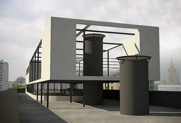
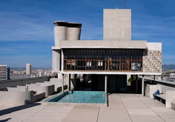
Further outrage has been voiced by the Daily Mail when it is revealed that the BBC have installed a lift so that the BBC presenters (or more likely the technicians and all their equipment) don't need to use the stairs inside the hospital.
While the exterior is not much to write home about, the interior is shocking. It's like some kind of nightmare art-deco Changing Rooms makeover. Randomly placed objects are internally lit with a vivid pulsing orange light. To hide a structural element the set designers have placed a kind of orange, ribbed, vortex device which dominates the field of view. I can't stop looking at it, half expecting it to suddenly interrupt Alan Hansen with some insightful half-time analysis. Table Mountain in the distance stands no chance. The studio table, on the other hand, is centre stage, its shape seems to continually shift, its purpose sinister and unknown. Its function seems only to provide spatial separation between gurning idiot Gary Lineker and the 3 randomly selected pundits lined up opposite.
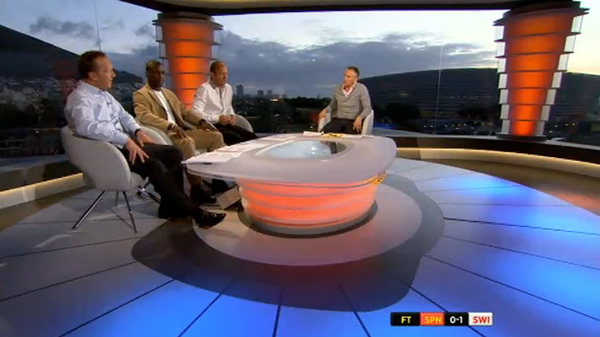
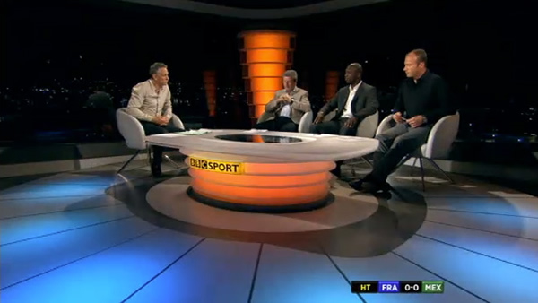
The floor with its radial lines, the table, the vortex column thingy, and the pentagonal shaped box, combined with the intense distortion caused by the wide angle lenses the camera-men are forced to used, creates a dizzying perspective. The space seems to defy geometry itself. Things have gone all non-Euclidean, like something out of an HP Lovecraft novel.
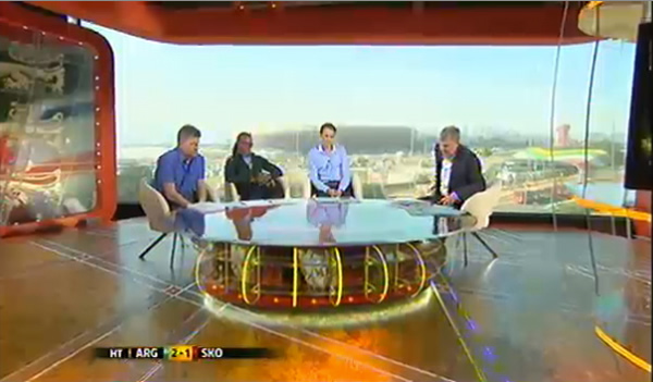
Still, if the BBC's set design is woeful, ITV's set is an abomination. I spend all of half-time transfixed by the day-glo plexi-glass fins that protrude from the table that divides the doughy Adrian Chiles from the moronic Andy Townsend. It's the sort of design that John Outram might come up after a 4-day Angel Dust bender. I wonder if there is some secret school of architecture or interior design where students take mind-altering drugs in order to develop the art of sports studio design.
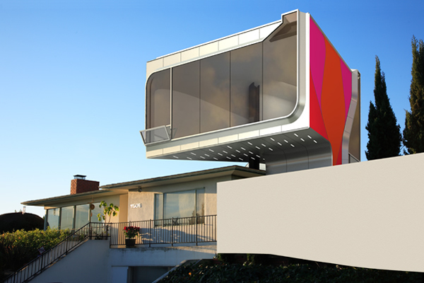
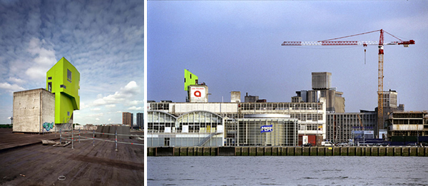
Hopefully in 2014 the BBC will call in Neil Denari or Korteknie Stuhlmacher Architecten to create something futuristic and thrilling, and with an interior to match. In the meantime, if your idea of fine dining is sitting on the roof of an unfinished shopping centre looking at giant building site, you could always the new pop-up restaurant at Studio East Dining.
