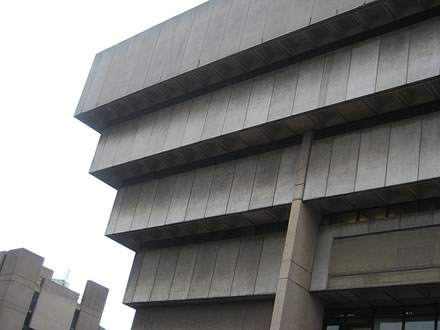
image by Flickr user manicstreetpreacher
Thanks to Rob over at No. 2 Self, we can enjoy a remarkable TV programme, shot in 1965, one of a series called Six Men, profiling an architect from Birmingham, John Madin. Click here to watch it.
There has been a resurgence of interest in the work of John Madin since Birmingham City Council decided they were going to knock down one of his later works, the Birmingham Central Library. More on this below.
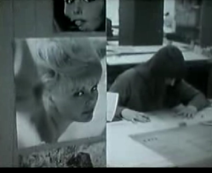
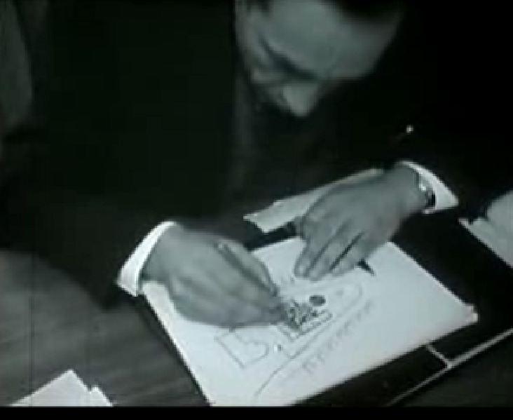
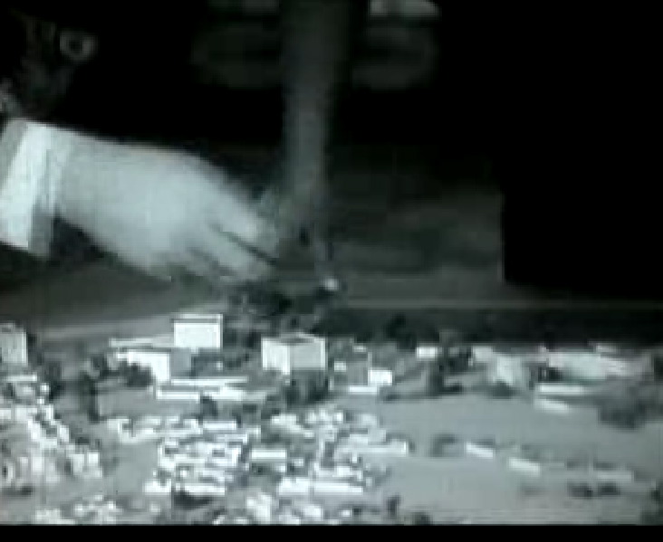
Back to Six Men. In this episode we see Madin striding purposefully towards his office, talking through plans with staff, presenting designs to clients, and enjoying time with his young children.
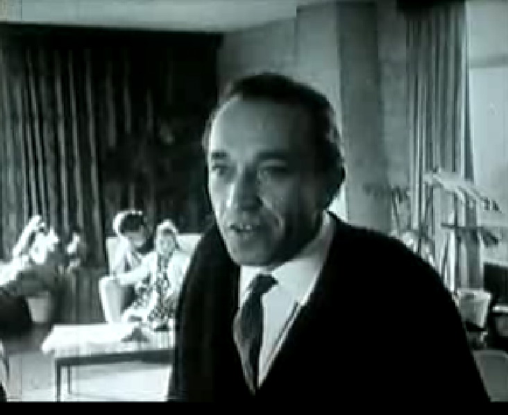
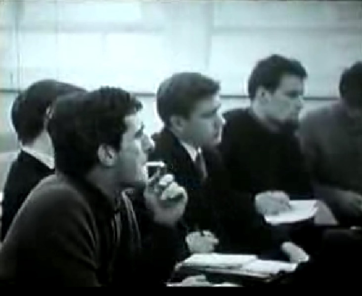
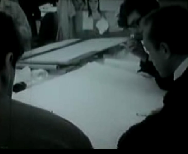
But it's the period touches that really stand out for me. The drawing boards, the blueprints, and especially the rampant smoking. Added to the casual sexism and disregard for secretaries, and it's easy to read Six Men: John Madin as a British architectural version of US hit TV show Mad Men.
Others have commented on the beautifully observed design touches of Mad Men, the TV show set in a New York advertising agency back in 1960. At the moment, designers seem to be in love with the mid-century aesthetic, with a yearning for the physicallity of Knoll furniture, IBM Selectric typewriters and a private office with your name on the door, contrasting against the ethereal placelessness of the laptop carrying, mobile-toting nomad, connected everywhere but inhabiting nowhere.
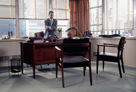

But why are advertising agencies such catnip for television producers, whereas architects seldom are? A mid-century Howard Roark/Don Draper character wowing clients with dazzling pitches, berating planners and haranguing contractors would surely be television gold. With the conflict between his beautiful Modernist house and family, and his trysts with the wives of his clients, why the scripts would almost write themselves.
But what of Birmingham Library? It's an intriguing building, an inverted ziggurat of gray concrete and glass. But at ground level it has never really worked, due to cost-cutting measures it was never fully realised according to Madin's design. My memory of it from the 80's was an empty windswept concourse, occupied only by puddles and the occasional skateboarder.
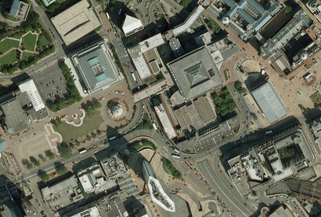
In the 90's, a bridge was built across the Paradise Circus roundabout, part of a long overdue strategy to free Birmingham from the stranglehold of its inner ring road. This linked Broad Street and Centenary Square, with the Rep Theatre, International Convention Centre and Symphony Hall, to the rest of the City Centre, turning the area underneath the library into a thoroughfare. This area was then decked out with a rather naff assortment of shops and cafes - Wetherspoons and McDonalds anyone? - another missed opportunity to make some special in this intriguing void.
The new library, to be designed by the excellent Dutch practice Mecanoo, is to sit between Baskerville House, and the Rep Theatre, while the old library is to be demolished to make way for more commercial development that will fund the new library and further development of Centenary Square.
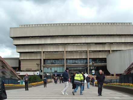
I've no doubt that Mecanoo's new library building will be exquisite, as long as the Council don't start interfering in its design. But, regardless of what you think of Madin's building, demolishing the old Central Library won't solve the problem that exists between Centenary Square and the City Centre. It is the other buildings around the library that are the problem. Opening up the site to commercial development has already given us two hideous black-glazed hotels, and a building (the triangular building on the north corner of Paradise Circus - I think it was originally built for Barclaycard) so unspeakably awful that it makes me sick in the mouth just thinking about it. It's as if someone found a secret Ugly command in AutoCad - Ctrl-Alt-Shift-U - and kept hitting it repeatedly.
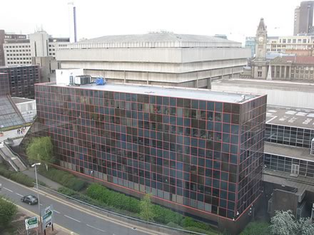
image by Flickr user kevin_r_boyd
Take a look at this picture and think which building you think should be demolished. I'm sceptical that selling the land on which the current library sits, for commercial development, is the way create a unified public realm between Centenary Square through to Chamberlain Square and the rest of Birmingham City Centre. But then Birmingham always seems to find a way to shoot itself in the foot.
