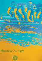
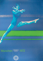
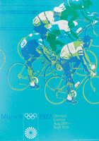
The recent exhibition at Vitsoe of the design work by Otl Aicher for the Munich 72 Olympics took my breath away.
Designed by Bibiliotheque, to coincide with the recently published book about Aicher, the exhibition shows a glimpse of the extraordinary gestamkunstwerk that Aicher and his team executed over the course of 6 years before during and after the Olympics. As an example of a design aesthetic delivered rigourously across all media including posters, tickets, documentation, uniforms and badges, there are probably few better examples.
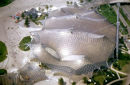
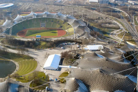
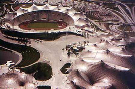
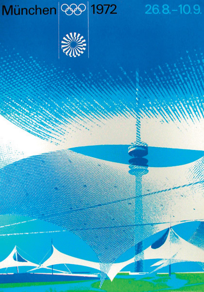
One aspect that fascinated me was the contrast between the colourful, geometric, application of the visual identity with it's strict ordering and grid, with the monochromatic, fluid and organic form of the Olympic Stadium and park by Frei Otto and Gunter Behnisch. Aicher's work offers no attempt to reflect the look of the stadium, but instead contrasts it completley, creating a powerful synthesis between the graphics and the architecture. The two are brought together in this stunning poster:
In 2012 the Olympics come to London. Let's hope the graphic design and architecture can come close to matching the brilliance of Munich '72.
