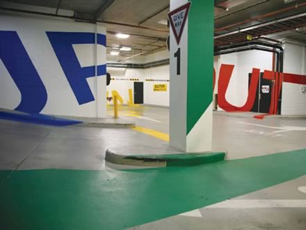
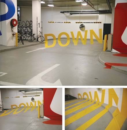
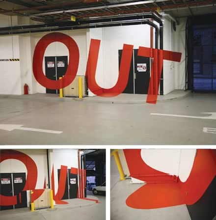
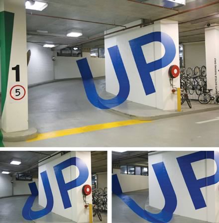
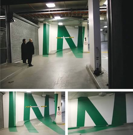
This has been around now for a while, but is still worth revisiting. The Eureka Car Park, in Melbourne, features a signage system created by Axel Peemoeller while working at Emery Studio. The letter forms are distorted acros the vertical and horizontal services, so that when viewed from the correct position, they can be read perfectly.
From the Emery Studio website:
"An opportunity to exploit the potential of the vertical and horizontal surfaces of the entry, as a sequence of monumental messages that enhance the experience of arrival and departure through bold graphic illusions."
Such Anamorphic images have been used in art for many years (eg Holbein's painting The Ambassadors), and have also in more recent years been common on televised sports pitches, such as cricket and rugby, but this is the first time I have seen them used for wayfinding. Wouldn't it be amazing if the apparent jumble of signs and symbolds across a city, when viewed from a certain vantage point, resolved into a beautiful coherent image?
Previously:
